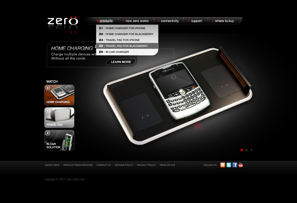
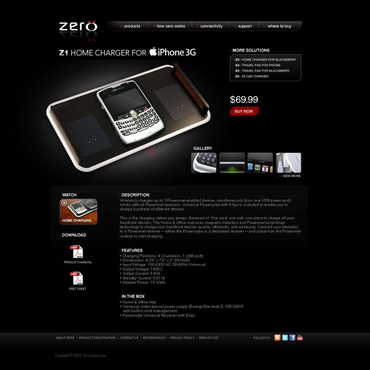
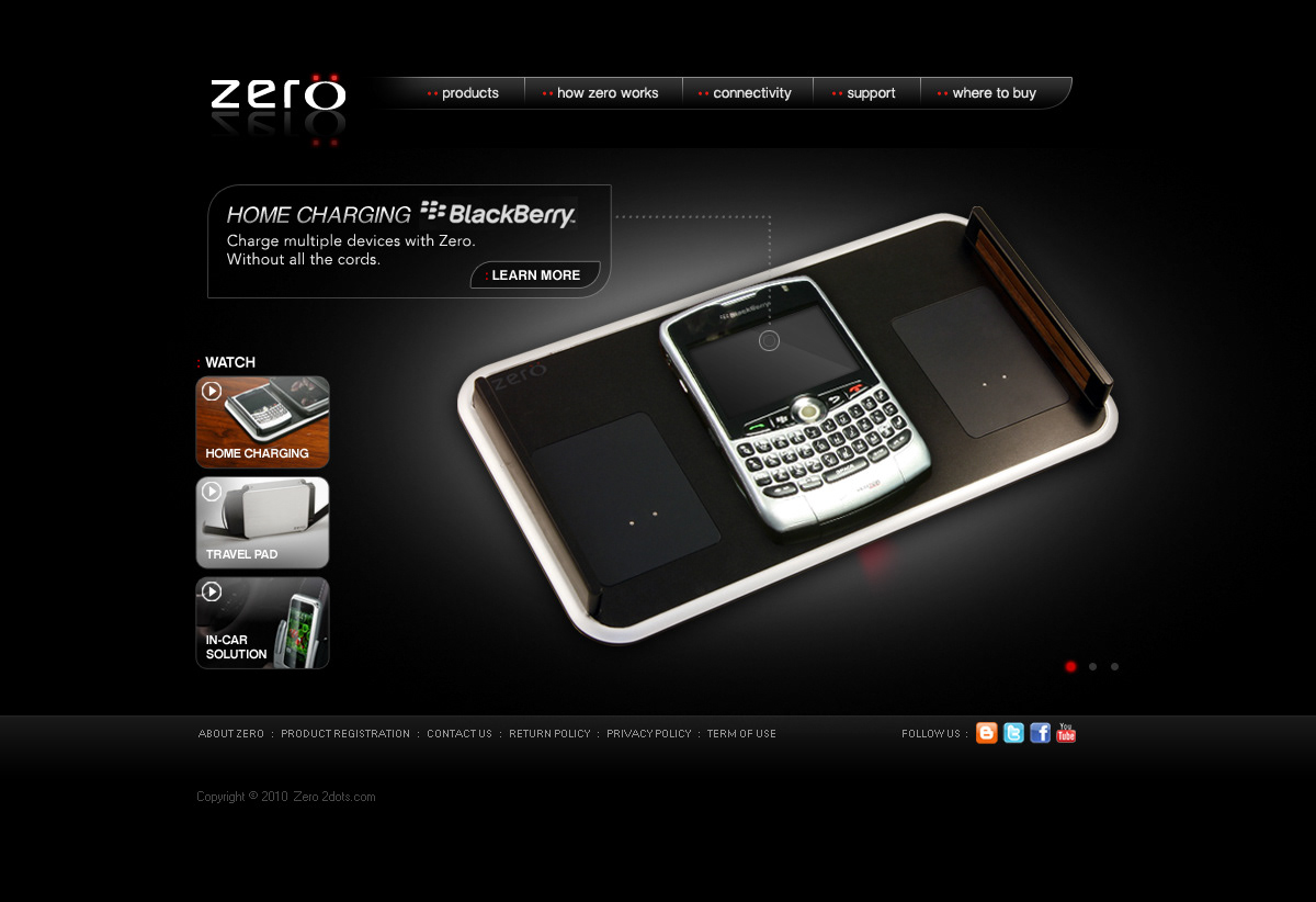
Zero was a sub-brand of Tofasco that carried a product line of wireless charging stations and charging pads for mobile devices. The website design took cues from the edgy logo: the two red dots over the "O" mimic the wireless connecters that are attached to the mobile devices that then connect to the two dots seen on the charging pads. I wanted the branding design to feel sharp, sleek, mysterious, and somewhat metallic. This look carried over into the packaging and product videos as well.
The navigation and the homepage slider were built and animated in Flash, while content pages were mostly HTML. When first launching the site in a browser, a brief Flash-animated intro would display before main homepage appeared. It's worth mentioning that this design is from 2010, before websites really began the transition away from Flash interactivity.