

For over six years, I worked as the primary in-house graphic designer for Arecont Vision (now AV Costar). The company specializes in multi-megapixel IP security cameras, and originally owned the market for multi-sensor 180° panoramic cameras, as well as 360°-view and omni-view cameras. When I joined the company in 2012, the company branding and messaging was not cohesive or consistent, and product photography and graphical elements were sub-par quality at best.
I worked on standardizing brand elements, graphics, logos, product photography, and content, as I updated brochures, spec sheets, webpages, trade show graphics, presentations, videos, and anything else related to visual marketing through the company.
Product Photography Overhaul
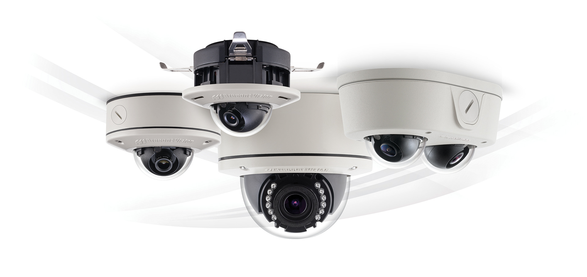
One of the first areas I began to standardize graphics for Arecont Vision was product photography. Most of the existing products had all been shot separately with different lighting and angles. Existing group photos would often look like the lower left example, with no plan of how they were put together. Additionally, the domes on security cameras create a headache with their glare and reflectivity.
I lead a reshoot of the existing product line and planned out angle and lighting guidelines with the photographer so all current and future photography would have consistency. Domes were shot separately from the cameras they belonged to, which provided better control of the reflectivity in post production. This also allowed for much cleaner and clearer views of the camera sensors in every product photo.
Maybe the best part, I could now easily create group shots of cameras and swap individual products out as needed for different marketing campaigns and collateral needs.
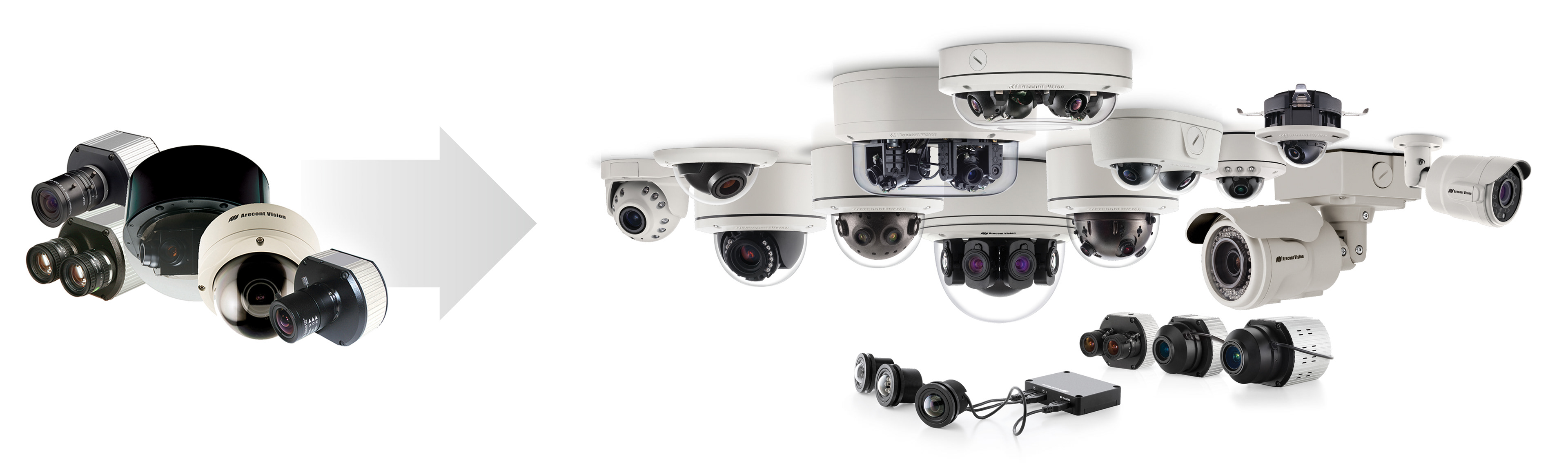
Left: at typical product group photo from the company before I came aboard. Right: One of the full product family group photos I created for marketing purposes.
Logos & Brand Names
I made adjustments to the company logo to have a cleaner look on all marketing materials and packaging. The company wanted a new tagline, "Leading the Way in Megapixel Video", which paved the way for making needed changes to how the logo was used and structured on everything across the company.
The original logos had an unbalanced structure with how the old tagline worked with it. Additionally, the "AV" symbol had a strange alignment with the company name in this format and sometimes would show up in materials this way with the tagline removed. Color choices for the logo were inconsistent across existing marketing materials.
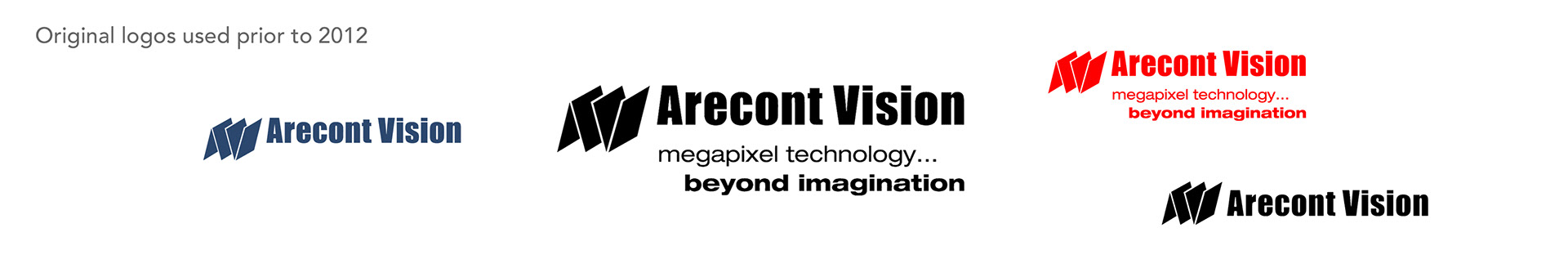
I updated the tagline version of the logo to utilize a red line, which extended infinitely to the left and right at the top of documents and collateral, packaging, and trade show graphics. I didn't want the color red to be overpowering throughout the branding, so red was used in very specific situations, like the line in the logo, in product brand names, for bullets on a bulleted list, and for important buttons and links on the website.
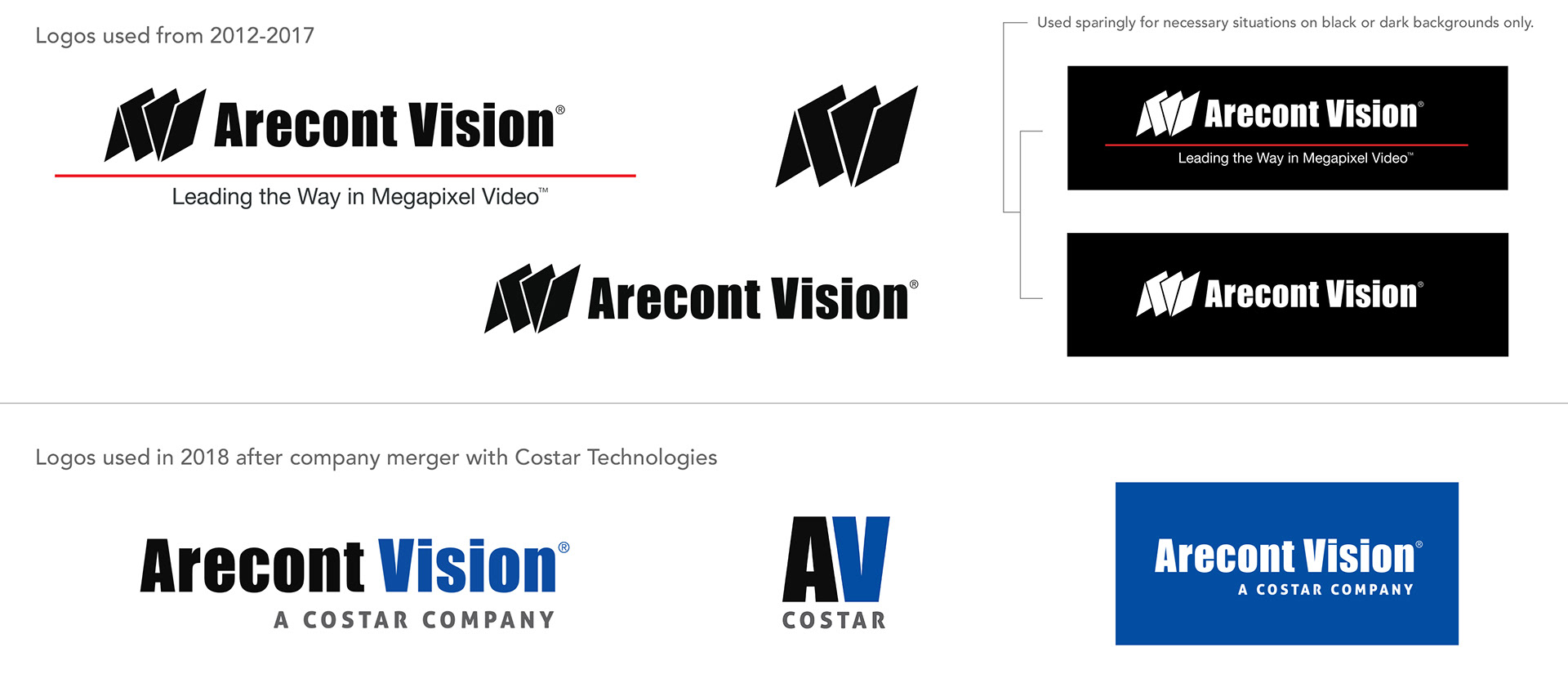
The company was acquired by Costar Technologies in late 2018. This marked the end for the use of red in company branding, as well for the abstract "AV" icon that was part of the logo. A decision was made to keep the existing font for the name as call back to the company that once was. For "A Costar Company", I had the opportunity to introduce a more contemporary font that nicely complimented the existing "Arecont Vision" font. The blue and gray colors Costar Technologies used across their brands was added for "Vision" and the tagline respectively. A reversed-out version of the logo worked well on a black background or the "Costar blue".
Product Brand Names
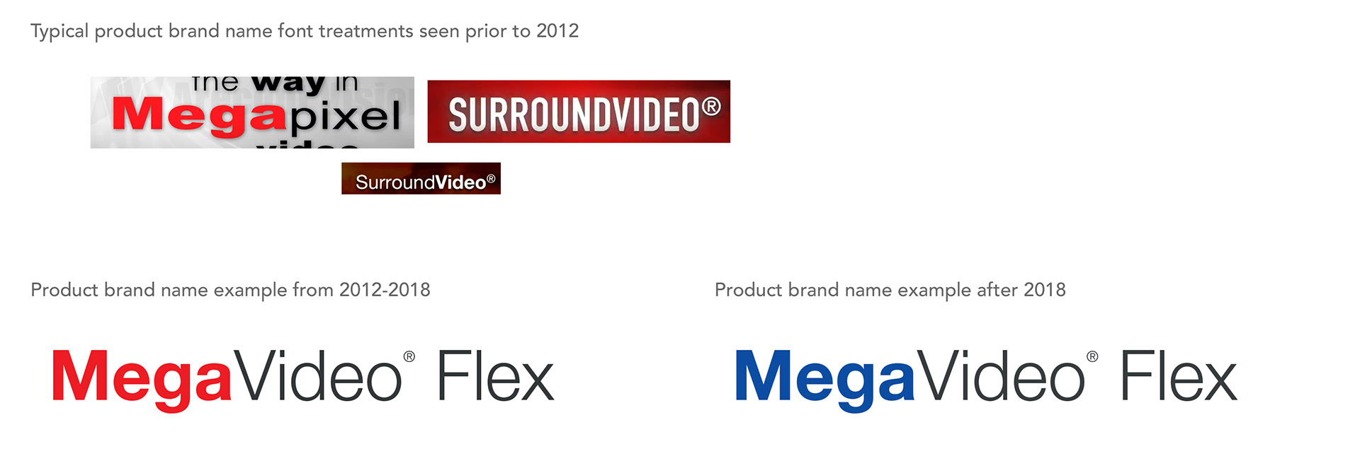
The company had a branding name for every specific product line. In existing materials prior to 2012, the font treatments varied widely. Sometimes the front part of the name would be bolded for emphasis, sometimes the second part of the name would be bolded instead. Sometimes two different fonts would be used with different colors, sizes, and so on.
I standardized the font treatments across the board, making sure that the first part of the compound name was in bolded red, and the second part in a "light" thickness in a very dark gray. This became the logo style for each product line to use across all marketing materials everywhere, except for body text sentences, paragraphs, and captions. The color red was turned to blue after the merger with Costar Technologies, and the gray was lighted slightly.
Iconography
Iconography was nonexistent in the company when I joined the team. A lot of marketing materials were very text-heavy with no visual breaks. Adding icons helped break up the text and give "visual bullet points" to various marketing and technical specification points of interest for products.
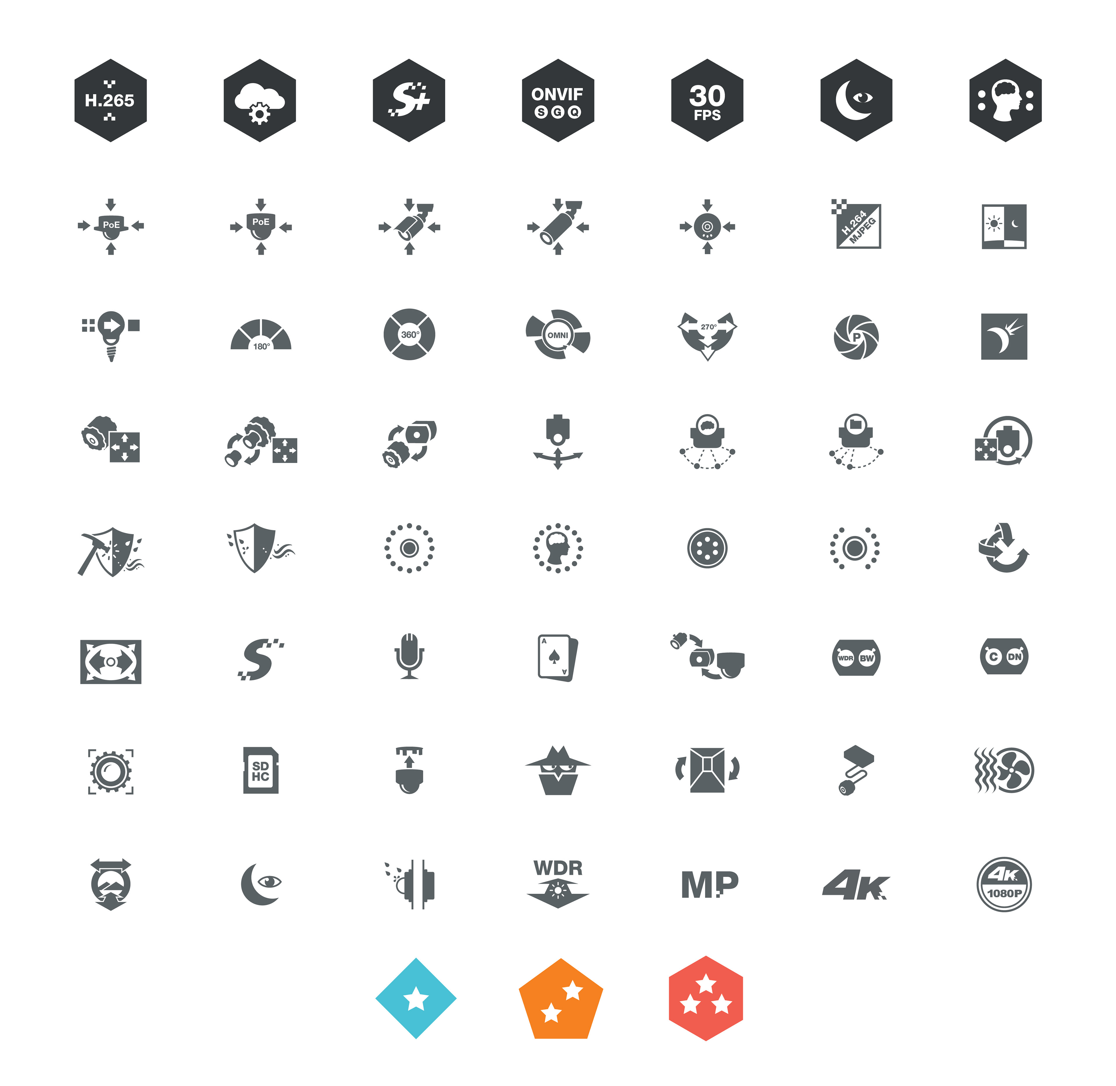
A sampling of icons used on everything from packaging, specification sheets, marketing collateral, trade show graphics, presentations, online product pages, and more.
Arecont Vision also released software tools and mobile apps to work with their products. Below are a few icons designed for those needs.
Some of the icons used for computer software and mobile apps.
Background Elements
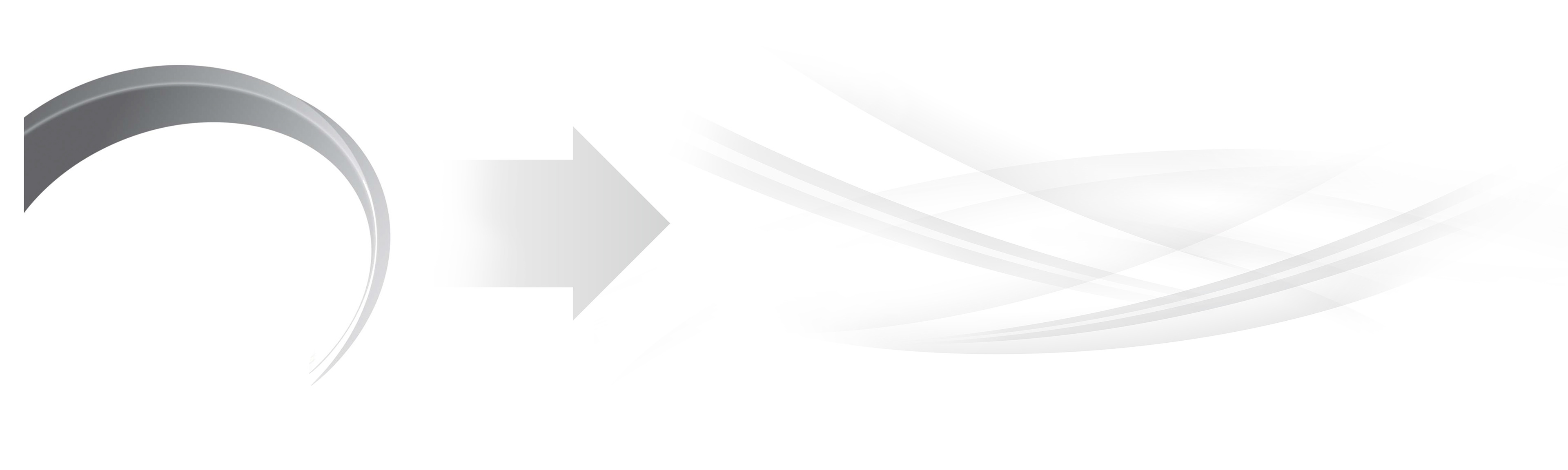
When I started with Arecont Vision, the company already had a "swoosh" that was used behind product images and other specific situations. It was graphically plain and a bit overbearing. I gave the swoosh a refresh that was softer and could be manipulated easier to work with different spaces.
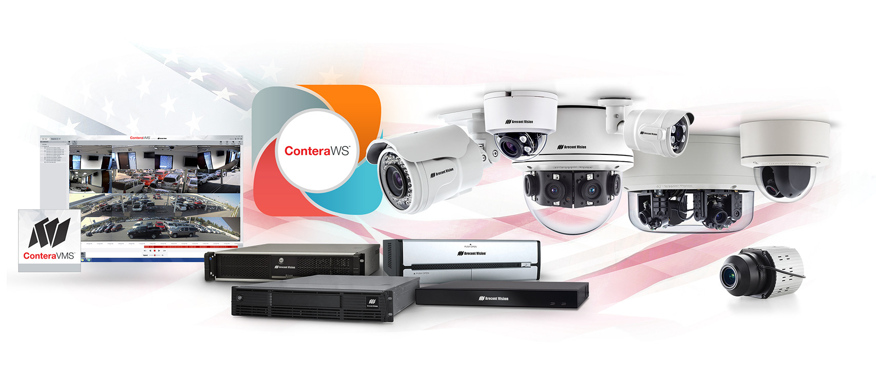
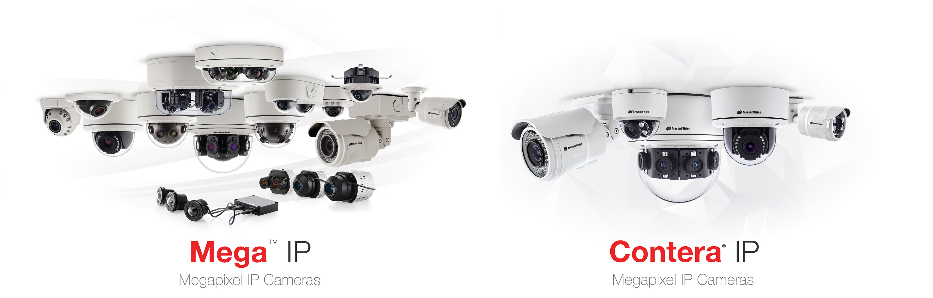
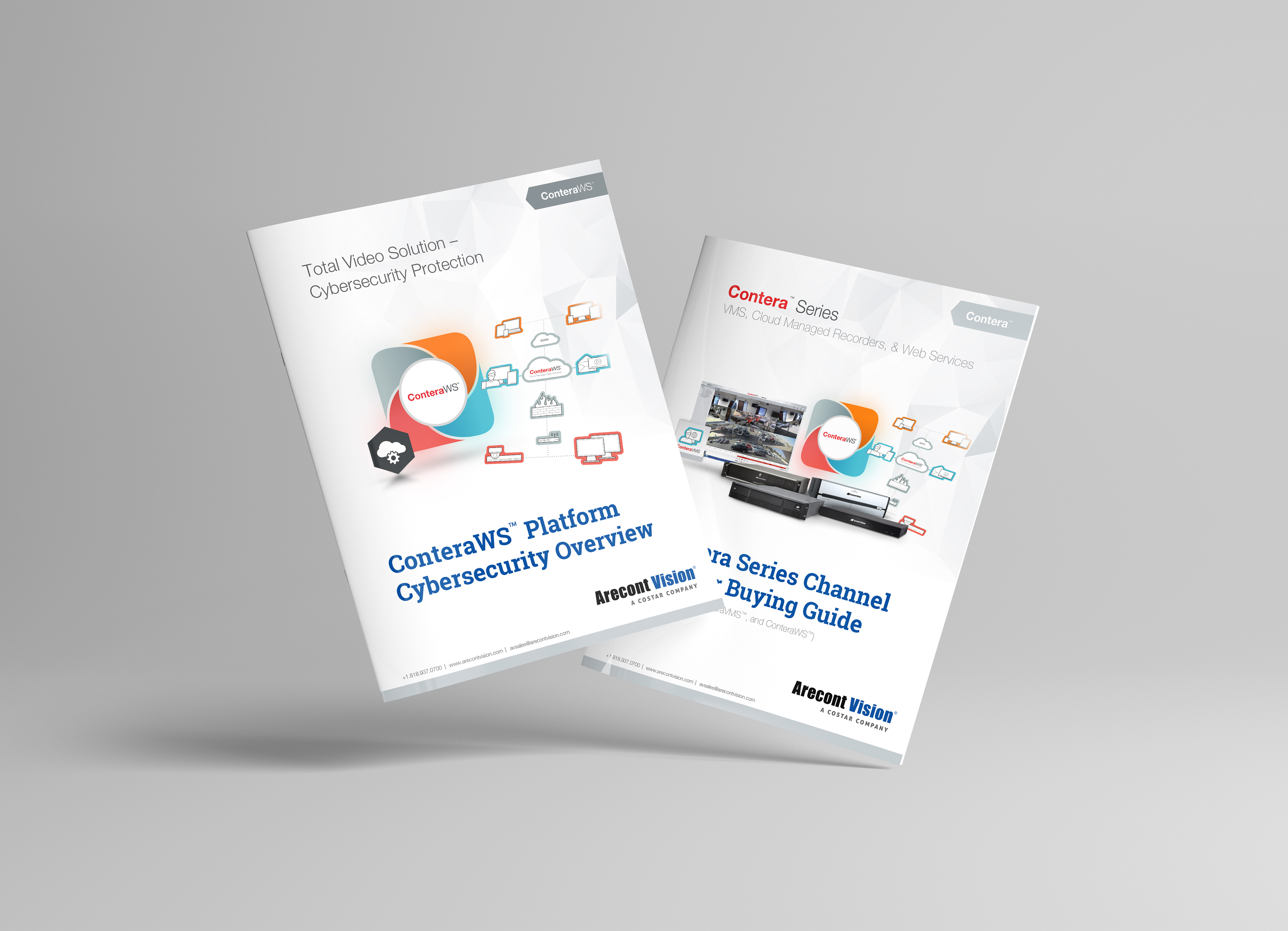
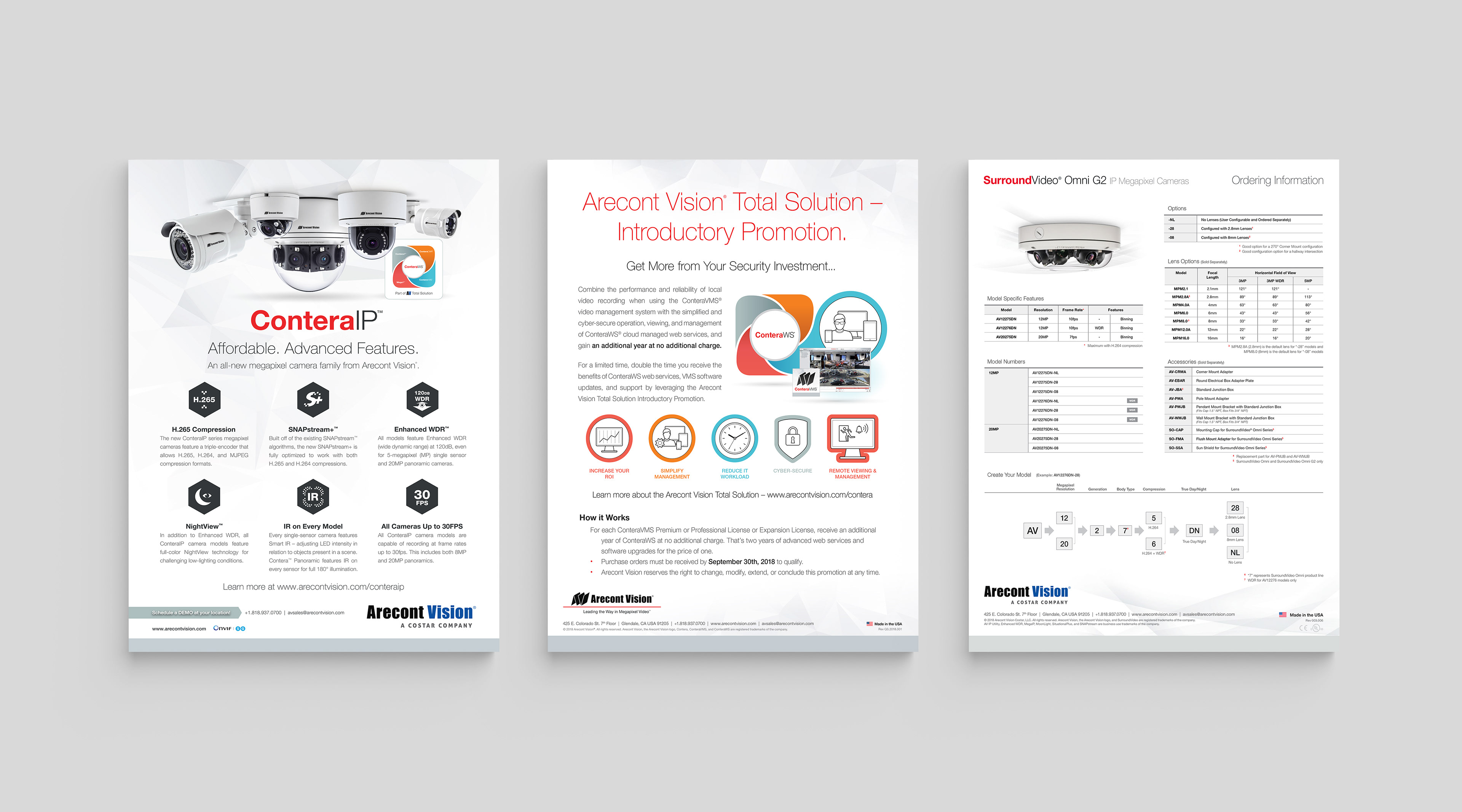
Eventually, Arecont Vision introduced a new product line called "Contera" that would be branded completely separate from their long existing "Mega" line of cameras. This created an opportunity for a new background element, specifically for the Contera product line. "Contera" was about "connectivity", so I went with a triangular background that subliminally gave a feeling of lines connecting to different places like a network, as the Contera product line consisted of IP cameras, NVRs, and VMS software to create a total security solution.
Font Treatments
Font guidelines needed a major overhaul throughout all marketing assets. Specification sheets and brochures for example were at times using entirely different font sets and treatments. Below are the styles I came up with to use across most marketing materials.
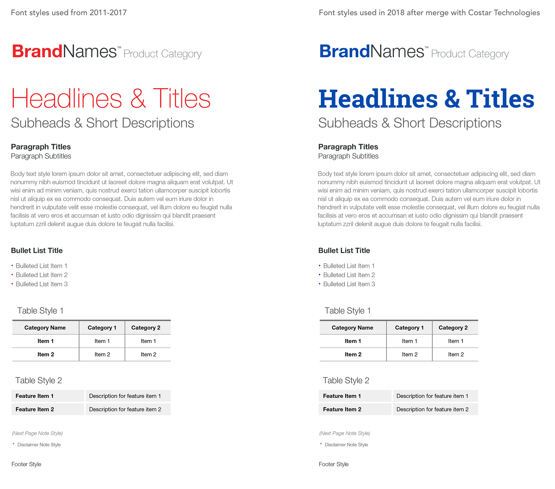
All fonts used from 2011-2017 were from the "HelveticaNeue LTStd" font family. In 2018, I introduced "Roboto Slab Bold" to use for the main title font as part of the Costar Technologies rebranding effort.
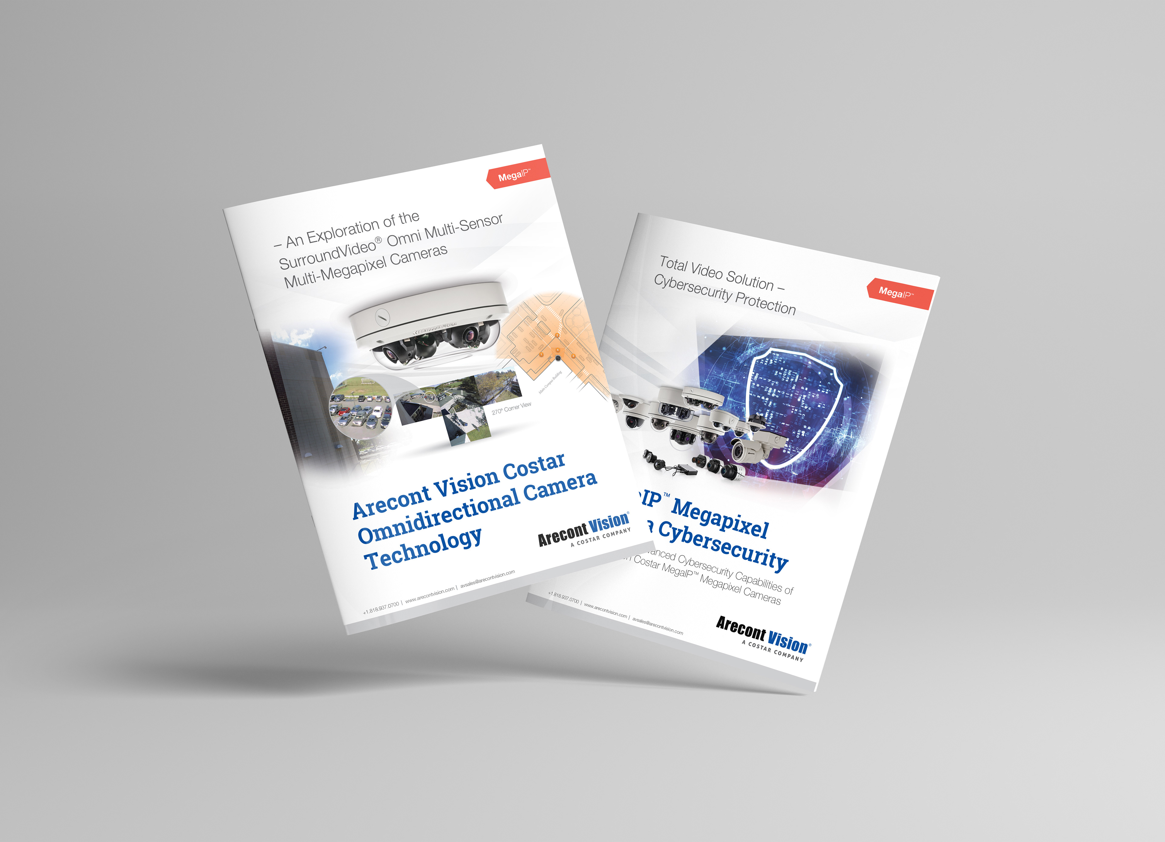
Collateral & Advertisement Examples
More to Explore: